Monday, January 26, 2009

Journey with a Thousand Heroes

For many years I've been interested in how stories are structured—more specifically, the hero's journey. I became aware of this mythic story structure on TV when I saw a PBS series with Bill Moyers interviewing Joseph Campbell, called "Joseph Campbell and the Power of Myth." Wow —really great stuff. Campbell talks about how we've inherited a story structure that has been passed down to us from thousands of years - and from all cultures. 

A thumbnail of the structure goes like this: 

We first see the hero in their ordinary world, but something's not right. Either the hero needs growth in some aspect of their life, or something from the outside forces them to change, thereby sending them into the new world of Act 2...

In this new world, the hero faces challenges, meets new friends (and enemies), and strives towards getting back to the old world with the treasure and themselves intact. But things rarely go that easily, and when the hero is farthest away from their goal, a new tactic is needed. Which sends them into Act 3...

Act 3 is all or nothing, do or die. The hero needs everything they've learned from their Act 2 turmoils to succeed and walk away with the illusive prize. Sometimes they don't do it. Sometimes it means death—if not a physical death, then a death of some part of them, which leaves them better than when they began the journey. In the last step in the sequence, the hero returns to the world and brings their new knowledge to the rest of us. 

In the series, Campbell talks about the myths we all live with, how these myths help us at different stages of our lives, and how these myths are pretty much the same in every culture around the world.  
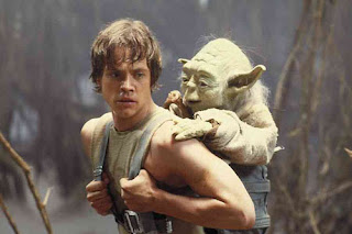


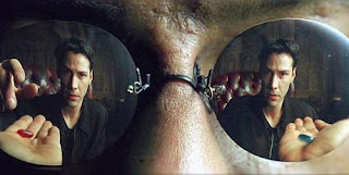
Star Wars and The Matrix are classic examples of the hero's journey at work - all films (and stories) have at least some mythic elements embedded in them, which is why they strike us so deeply. The best filmmakers have tapped into this mythic structure and create new worlds that ring with authenticity.  


In his seminal book "The Hero with a Thousand Faces," Campbell talks about stories from around the world and how they all stick to certain story principles. As a professor, he loved the details of each culture's myths; by comparing them, he shows how they address the emotional and spiritual needs of the communities they are from. That said, the book is not an easy read, but very worthwhile. 

Another great book on the subject is "The Writer's Journey" by Christopher Vogler. This book breaks down Campbell's ideas into easy, understandable language and gives a blueprint of "The Wizard of Oz" and how it works within this structure. 

Both these books are well worth the price. I've done a brief Flash overview on the high points of these books that can be found here

Nothing happening? You may need a Flash Player...
You can get one here.

Monday, January 19, 2009

Lost in Translation

Whether it's NTSC, Mac, or PC color space, how do you know your images will translate correctly and look the way you want them to?

Color Management... I know, sounds a little, well, dry. Yeah.
It is, but it's also pretty darn painless. With a few clicks and a couple of pull-down menus, you can know:
1. How After Effects sees and interprets your footage, and what that means to your output.
2. What you can do about it.
Doesn't that sound good?

First, we'll look at the Project Window. After highlighting the file, you can look at the top of the project window and see how AE sees your footage:


"Millions of Colors" in the top box and JPEG under "Type". That's all great, but this only tells me it's a still photo with pretty good color...
But, if you hit the bit depth setting at the bottom of the project window, the project settings window will be displayed:


Here you get a lot more info about what's going on, and what you can do to change it.


As you can see, the box is broken into different sections that deal with different things:
Display Style, Color Settings, and Audio Settings
The only one we're concerned with now is "Color Settings."

This is where the action is, as far as what your footage looks like.
The first thing I would recommend is:
Always use 16 or 32 bit color. 16 is good, 32 is very good, but 32 can slow your machine down to sloth time.
(The speed of your machine and the quality of output you need will dictate which you choose.)

Next, and just as important, are the "Working Space" settings. If this is set to "None," it will not interpret your footage and give the generic "Millions of Colors" description we saw earlier. For this project, I'm going to set the "Working Space" to SDTV NTSC (and a bit depth of 16).


By changing the "Working Space" settings to anything other than "None", AE will start seeing your footage, as opposed to looking at it:


As you can see, suddenly we have a "Profile" sitting under the "Millions of Colors" declaration. This is good. Now AE sees the photo and can read the color info embedded in it.

There are times when you might want to override the original color profile. One reason would be moving between platforms: Windows to Mac or vice-versa.
Images saved on a Windows machine will be saved as an sRGB color profile. These will look a bit washed out on a Mac. Images saved on a Mac will use the Apple RGB profile, and these will look dark on a Windows machine.

If you select the file in the Project Window and hit command-F, the Interpret Footage window will be displayed:


There you can override the original color profile if need be and get your bobber looking like it should.

With NTSC:


With sRGB:


With Apple RGB:


Or one of the other flavors that might suit your output needs....

Happy coloring!

Tuesday, January 13, 2009

Curves

Ever wonder why there are so many different kinds of tools to correct color? I have no idea, so if you want an answer to that, you'll to have to go somewhere else... But one guess is comfort. I have generally feel more comfortable with Levels and Hue/Saturation controls than with Curves - Curves feel a little unwieldy to me, but I'm starting to get the hang of it - check this out...
Here is the original image:


As you can see, this pic has some problems - the main one is that there's no real shadow or highlights - it's pretty much all gamma, everything is in the mids and the RGB parade confirms that -


But with a few tweaks, you can have this!


Pretty sweet, huh? Yeah, awesome....

But really, if you use a light hand when using Curves it's actually a pretty cool color corrector, and fast.

When you look at the Curves grid, it's set up in a very logical way - the bottom of the grid is your lift or shadow, mid section of the grid is your gamma, and the top of the grid is your highlights or gain.


One of the quick and dirty ways to pull a picture into shape is a simple "S" shape on the "master" or "RGB" Curves selector.


As you can see, this simple tweak brings the picture into pretty good shape.

And looking at the scopes we can see the ranges have spread out - the shadows sit down where they should be, and the highlights are about right.


Something's bugging me, let me step back a bit... The crest of her nose is a little too hot, so I'm going to soften the "S" on my RGB master:


Ok, that's about right... So the next question would be what type of light are you looking for? Mid summer? Cool fall? Winter? Or are you trying to match another shot? That's where the individual RGB controls come in handy...

For this picture I'm going to be working in the red and blue channels of the Curves effect and adjusting accordingly...
A little warmer...

A little cooler...

Or colder still:


These fast tweaks can put you in the ball park quickly without breaking a sweat.

Happy coloring!

Sunday, January 4, 2009

Scopes!

Ok, film's not dead yet, but it's getting pretty damn close—at least for the Indie filmmaker. So where does that leave those of us who have to shoot digital?

First off, film has some great things about it—not only the quality, but also the consistency. Whenever we go see a film, we get what the filmmaker wants us to see. But with people making movies on everything from high-end digital cameras to cell phones, the range of what we see, whether it's YouTube or your local Indie production, is up for grabs.

Most of it looks like hell, at least if you're trying to make something that looks like a movie. That's where scopes come into play. Scopes are key to making sure your images look the way you want them to— wherever they are seen—Web, TV, film festival. You're never going to have complete control, but making sure your pictures are scoped out is a big step in the right direction.

Most people think, "Scope? Yeah, I looked in the back of a news truck once—no way!" And yes, most hardware scopes are at least a few thousand bucks. Definitely more than I want to spend. But now there are a variety of software scopes, and they'll make a huge difference in the quality of your productions.

I use Test Gear 2 by Synthetic Aperture. $100 bucks. It's a plug-in for After Effects and gives you a decent picture of what's going on. I'm also partial to Colorista, another AE plug-in that comes with the Magic Bullet suite.
With those tools and a little tweaking, I brought this:

—a scene I shot with no lights under trees—run and gun with an old TRV-900;
—to this—
which is much closer to what I was thinking about before I shot...
And it's legal (consistent wherever it's shown). I know because the scopes are showing me what's going on.

Scopes = friend.
Use 'em.